
The Best Font Pairings for Squarespace Websites
It can be a struggle to pick fonts for your website when there are such a wide range available on Squarespace. It can even be overwhelming to sort through all the different styles and choose those that best fit your brand and business.
When people visit your website, do you want them to feel calm? Excited? Happy? Thoughtful? Fonts can help you convey certain emotions to your audience, and help you attract your ideal target clients and customers.
The fonts also need to be clear, easy to read and modern enough that people won’t be put off by a website that looks outdated. If your website looks outdated or unprofessional, it won’t be trusted.
To help you out, I’ve chosen five timeless font pairings that are available on Squarespace and will work for a wide variety of businesses! These fonts are also available on Adobe Fonts for free if you have a Creative Cloud subscription.
Font Pairing #1: Feminine, Modern

This font pairing is ideal for a brand with a largely a female audience, wanting a professional, timeless for their website. Montserrat is a popular, modern font that many people are familiar with, and the combination is perfect for designers and bloggers.
Heading: Orpheus Neue
Subtitle: Monserrat
Paragraph: Montserrat
Font Pairing #2: Professional, Timeless

Perfect for lawyers, coaches and shops, this timeless combination provides a sense of professionalism and trust. This pairing is created with two typefaces that never go out of style.
Heading: Adobe Garamond
Subtitle: Proxima Nova
Paragraph: Proxima Nova
Font Pairing #3: Elegant, Elevated

This font pairing works very well for anyone offering premium services – the use of a serif for the paragraph text helps to suggest a higher price range, complimented by the elegant san-serif that is Calluna Sans.
Heading: Calluna Sans
Subtitle: Adobe Caslon Pro
Paragraph: Adobe Caslon Pro
Font Pairing #4: Clean, Contemporary
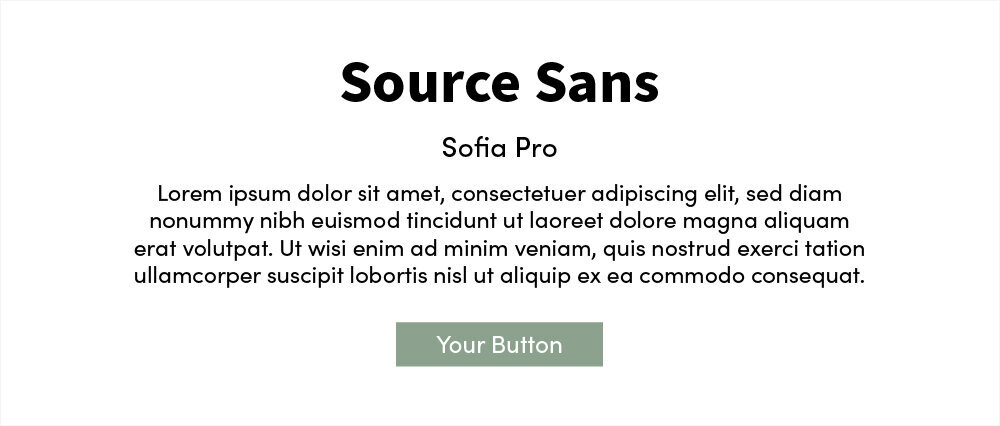
The roundness of Sofia Pro makes this combination great for any business looking to seem welcoming, candid and clear. If your business focuses on contemporary offerings like digital products, this may be the pairing for you!
Heading: Source Sans
Subtitle: Sofia Pro
Paragraph: Sofia Pro
Font Pairing #5: Simple, Sophisticated
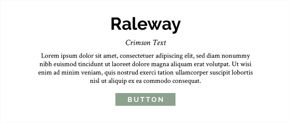
This pairing is ideal for a clean beauty brand, wellness coach or organic food company. The mixture of font weights gives this combination a great hierarchy and will always read clearly.
Heading: Raleway Bold
Subtitle: Crimson Text Italic
Paragraph: Crimson Text
The One Font Mistake to Avoid
Make sure you have contrast! The key to the perfect font combination is contrast.
All of the font pairings I’ve chosen have different types of contrast between each of the two fonts. It may be that I’ve chosen one serif and one sans serif – that’s contrast. It may be that I’ve chosen two sans-serif fonts, but one is clearly a thicker/heavier weight than the other. This is also contrast.
What you don’t want to do is choose two fonts with similar weights, or two that look almost identical. It won’t help with brand recognition or clarity when reading through your website!
Can You Add a Custom Font to Squarespace?
Maybe you have a brand font already that isn’t on Squarespace, or you have your heart set on another that just isn’t on the list.
You CAN add custom fonts to Squarespace! I have an entire blog post all about how to do this using CSS. It’s super simple to set up!